The Biggest Tech Talent Hubs in the U.S. and Canada
The Inflation Factor: How Rising Food and Energy Prices Impact the Economy
Ranked: The Most Popular Fast Food Brands in America
Ranked: America’s Best States to Do Business In
Visualizing Major Layoffs At U.S. Corporations
iPhone Now Makes Up the Majority of U.S. Smartphones
Visualized: The State of Central Bank Digital Currencies
The Evolution of Media: Visualizing a Data-Driven Future
33 Problems With Media in One Chart
The Top Downloaded Apps in 2022
Mapped: The World’s Billionaire Population, by Country
Charting the Relationship Between Wealth and Happiness, by Country
Mapped: A Snapshot of Wealth in Africa
Mapped: The Wealthiest Billionaire in Each U.S. State in 2022
Visualized: The State of Central Bank Digital Currencies
Visualizing the Relationship Between Cancer and Lifespan
Explainer: What to Know About Monkeypox
Visualizing How COVID-19 Antiviral Pills and Vaccines Work at the Cellular Level
Mapped: The Most Common Illicit Drugs in the World
Visualizing The Most Widespread Blood Types in Every Country
What is the Cost of Europe’s Energy Crisis?
All Electric Semi Truck Models in One Graphic
The Inflation Factor: How Rising Food and Energy Prices Impact the Economy
Visualizing China’s Dominance in the Solar Panel Supply Chain
Visualizing 10 Years of Global EV Sales by Country
Mapped: Countries With the Highest Flood Risk
Ranked: The 20 Countries With the Fastest Declining Populations
Iconic Infographic Map Compares the World’s Mountains and Rivers
Mapped: A Decade of Population Growth and Decline in U.S. Counties
Mapped: The State of Global Democracy in 2022
Mapped: The 10 Largest Gold Mines in the World, by Production
The 50 Minerals Critical to U.S. Security
Visualizing China’s Dominance in Clean Energy Metals
The Periodic Table of Commodity Returns (2012-2021)
Visualizing the Abundance of Elements in the Earth’s Crust
Mapped: Countries With the Highest Flood Risk
Visualizing China’s Dominance in the Solar Panel Supply Chain
All the Contents of the Universe, in One Graphic
Explained: The Relationship Between Climate Change and Wildfires
Visualizing 10 Years of Global EV Sales by Country
Published
on
By
Open the large interactive version here 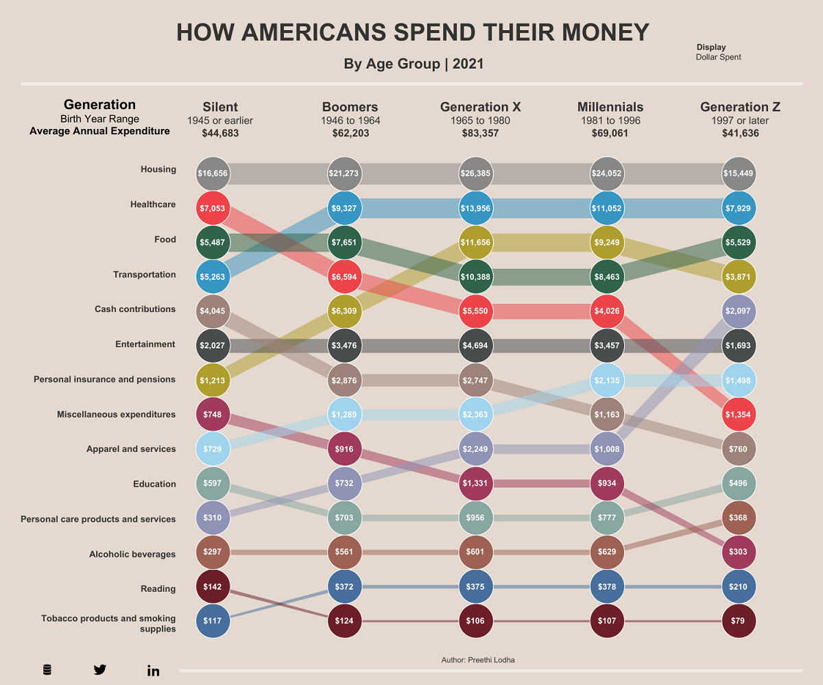
Open the large interactive version here
In 2021, the average American spent just over $60,000 a year. But where does all their money go? Unsurprisingly, spending habits vary wildly depending on age.
This graphic by Preethi Lodha uses data from the U.S. Bureau of Labor Statistics to show how average Americans spend their money, and how annual expenses vary across generations.
Overall in 2021, Gen X (anyone born from 1965 to 1980) spent the most money of any U.S. generation, with an average annual expenditure of $83,357.
Gen X has been nicknamed the “sandwich generation” because many members of this age group are financially supporting both their aging parents as well as children of their own.
The second biggest spenders are Millennials with an average annual expenditure of $69,061. Just like Gen X, this generation’s top three spending categories are housing, healthcare, and personal insurance.
On the opposite end of the spectrum, members of Generation Z are the lowest spenders with an average of $41,636. per year. Their spending habits are expected to ramp up, especially considering that in 2022 the oldest Gen Zers are just 25 and still early in their careers.
While spending habits vary depending on the age group, there are some categories that remain fairly consistent across the board.
One of the most consistent spending categories is housing—it’s by the far the biggest expense for all age groups, accounting for more than 30% of total annual spending for every generation.
Another spending category that’s surprisingly consistent across every generation is entertainment. All generations spent more than 4% of their total expenditures on entertainment, but none dedicated more than 5.6%.
Gen Zers spent the least on entertainment, which could boil down to the types of entertainment this generation typically enjoys. For instance, a study found that 51% of respondents aged 13-19 watch videos on Instagram on a weekly basis, while only 15% watch cable TV.
One category that varies the most between generations and relative needs is spending on healthcare.
As the table below shows, the Silent Generation spent an average of $7,053 on healthcare, or 15.8% of their total average spend. Comparatively, Gen Z only spent $1,354 on average, or 3.3% of their total average spend.
However, while the younger generations typically spend less on healthcare, they’re also less likely to be insured—so those who do get sick could be left with a hefty bill.
This article was published as a part of Visual Capitalist’s Creator Program, which features data-driven visuals from some of our favorite Creators around the world.
Visualizing the Material Impact of Global Urbanization
Charted: $5 Trillion in Fossil Fuel Subsidies
U.S. Inflation: Which Categories Have Been Hit the Hardest?
The World’s Most Used Apps, by Downstream Traffic
What Does it Cost to Run Big Business?
Visualizing U.S. Household Debt, by Generation
Is owning a home still realistic? This map lays out the salary you’d need to buy a home in 50 different U.S. metro areas.
Published
on
By
Depending on where you live, owning a home may seem like a far off dream or it could be fairly realistic. In New York City, for example, a person needs to be making at least six figures to buy a home, but in Cleveland you could do it with just over $45,000 a year.
This visual, using data from Home Sweet Home, maps out the annual salary you’d need for home ownership in 50 different U.S. cities.
Note: The map above refers to entire metro areas and uses Q1 2022 data on median home prices. The necessary salary was calculated by the source, looking at the base cost of principal, interest, property tax, and homeowner’s insurance.
San Jose is by far the most expensive city when it comes to purchasing a home. A person would need to earn over $330,000 annually to pay off the mortgage at a monthly rate of $7,718.
Here’s a closer look at the numbers:
Perhaps surprisingly, Boston residents need slightly higher earnings than New Yorkers to buy a home. The same is also true in Seattle and Los Angeles. Meanwhile, some of the cheapest cities to start buying up real estate in are Oklahoma City and Cleveland.
As of April, the rate of home ownership in the U.S. is 65%. This number represents the share of homes that are occupied by the owner, rather than rented out or vacant.
As of the time of this data (Q1 2022), the national yearly fixed mortgage rate sat at 4% and median home price at $368,200. This put the salary needed to buy a home at almost $76,000—the median national household income falls almost $9,000 below that.
But what kind of homes are people looking to purchase? Depending on where you live the type of home and square footage you can get will be very different.
In New York City, for example, there are fairly few stand-alone, single-family houses in the traditional sense—only around 4,000 are ever on the market. People in the Big Apple tend to buy condominiums or multi-family units.
Additionally, if you’re looking for luxury, not even seven figures will get you much in the big cities. In Miami, a million dollars will only buy you 833 square feet of prime real estate.
One thing is for sure: the typical American dream home of the big house with a yard and white picket fence is more attainable in smaller metro areas with ample suburbs.
The U.S. median household income is $67,500, meaning that today the typical family could only afford a home in about 15 of the 50 metro areas highlighted above, including New Orleans, Buffalo, and Indianapolis.
With the income gap widening in the U.S., the rental market remains a more attractive option for many, especially as prices are finally tapering off. The national median rent price was down nearly 3% from June to July for two-bedroom apartments.
At the end of the day, buying a home can be an important investment and may provide a sense of security, but it will be much easier to do in certain types of cities.
This infographic visualizes several net worth milestones to give you a better idea of where you stand today.
Published
on
By
The goalposts of wealth are always shifting due to inflation and other factors.
For example, someone with a net worth of $1 million several decades ago would have been considered very wealthy. According to recent survey results, however, $1 million is only enough to feel “financially comfortable” today.
In this infographic, we’ve visualized several money milestones to give you a better idea of what it really takes to be wealthy in America.
This table lists the data used in the above infographic.
It covers data on what it takes to get into the top one percent for wealth in key states, along with broader survey results about what net worth thresholds must be crossed in order to be considered “comfortable financially” or even “wealthy”.
According to Charles Schwab’s Modern Wealth Survey, a net worth of $774,000 is needed to feel “financially comfortable”, while $2.2 million is needed to be considered “wealthy”.
Both of these milestones are far greater than the average (median) American’s wealth, which according to the Federal Reserve, was $122,000 in 2019.
Research by Knight Frank determined that in order to be a member of America’s one percent, one would need a net worth of $4.4 million. This is very high compared to other developed countries such as Japan ($1.5 million), the UK ($1.8 million), and Australia ($2.8 million).
The difference is partly due to America’s large population of ultra high net worth individuals, which includes the country’s 724 billionaires. See below for a list of the top five countries by number of billionaires.
Source: World Population Review (As of 2021)
Focusing again on the U.S., we can also see large discrepancies at the individual state level. Entry into California’s one percent requires a net worth of $6.8 million, which is 62% higher than the national average.
California is famously home to many of the world’s richest people, including Google co-founder Larry Page, and Facebook founder Mark Zuckerberg.
Being a one percenter in Mississippi, on the other hand, requires $766,000. That’s 83% lower than the national average, and just a tad lower than the amount needed to be “financially comfortable” by the average American. This is partially due to Mississippi’s poverty rate of 19.6%, which according to the U.S. Census Bureau, is the highest in the country.
Mapped: The Wealthiest Billionaire in Each U.S. State in 2022
Charting the Relationship Between Wealth and Happiness, by Country
Mapped: The World’s Billionaire Population, by Country
Mapped: A Snapshot of Wealth in Africa
Ranked: The Top 25 Islands to Visit in 2022
Mapped: Countries With the Highest Flood Risk
Ranked: The Most Popular Fast Food Brands in America
Mapped: Which Countries Still Have a Monarchy?
Copyright © 2022 Visual Capitalist
Powerful Wealth Building Resources