Visualizing Major Layoffs At U.S. Corporations
3 Reasons for the Fertilizer and Food Shortage
Countries with the Highest Default Risk in 2022
The $100 Trillion Global Economy in One Chart
News Explainer: The Economic Crisis in Sri Lanka
The Evolution of Media: Visualizing a Data-Driven Future
33 Problems With Media in One Chart
The Top Downloaded Apps in 2022
Synthetic Biology: The $3.6 Trillion Science Changing Life as We Know It
How Do Big Tech Giants Make Their Billions?
Mapped: The Salary You Need to Buy a Home in 50 U.S. Cities
Countries with the Highest Default Risk in 2022
What Does It Take To Be Wealthy in America?
Household Income Distribution in the U.S. Visualized as 100 Homes
Interest Rate Hikes vs. Inflation Rate, by Country
Visualizing the Relationship Between Cancer and Lifespan
Explainer: What to Know About Monkeypox
Visualizing How COVID-19 Antiviral Pills and Vaccines Work at the Cellular Level
Mapped: The Most Common Illicit Drugs in the World
Visualizing The Most Widespread Blood Types in Every Country
Visualizing 10 Years of Global EV Sales by Country
Which Countries Produce the Most Natural Gas?
Visualizing the World’s Largest Oil Producers
A Lifetime’s Consumption of Fossil Fuels, Visualized
Visualized: Battery Vs. Hydrogen Fuel Cell
Ranked: The 20 Countries With the Fastest Declining Populations
Iconic Infographic Map Compares the World’s Mountains and Rivers
Mapped: A Decade of Population Growth and Decline in U.S. Counties
Mapped: The State of Global Democracy in 2022
Mapped: Solar and Wind Power by Country
Mapped: The 10 Largest Gold Mines in the World, by Production
The 50 Minerals Critical to U.S. Security
Visualizing China’s Dominance in Clean Energy Metals
The Periodic Table of Commodity Returns (2012-2021)
Visualizing the Abundance of Elements in the Earth’s Crust
All the Contents of the Universe, in One Graphic
Explained: The Relationship Between Climate Change and Wildfires
Visualizing 10 Years of Global EV Sales by Country
Timeline: The Domestication of Animals
5 Things to Know About Europe’s Scorching Heatwave
Published
on
By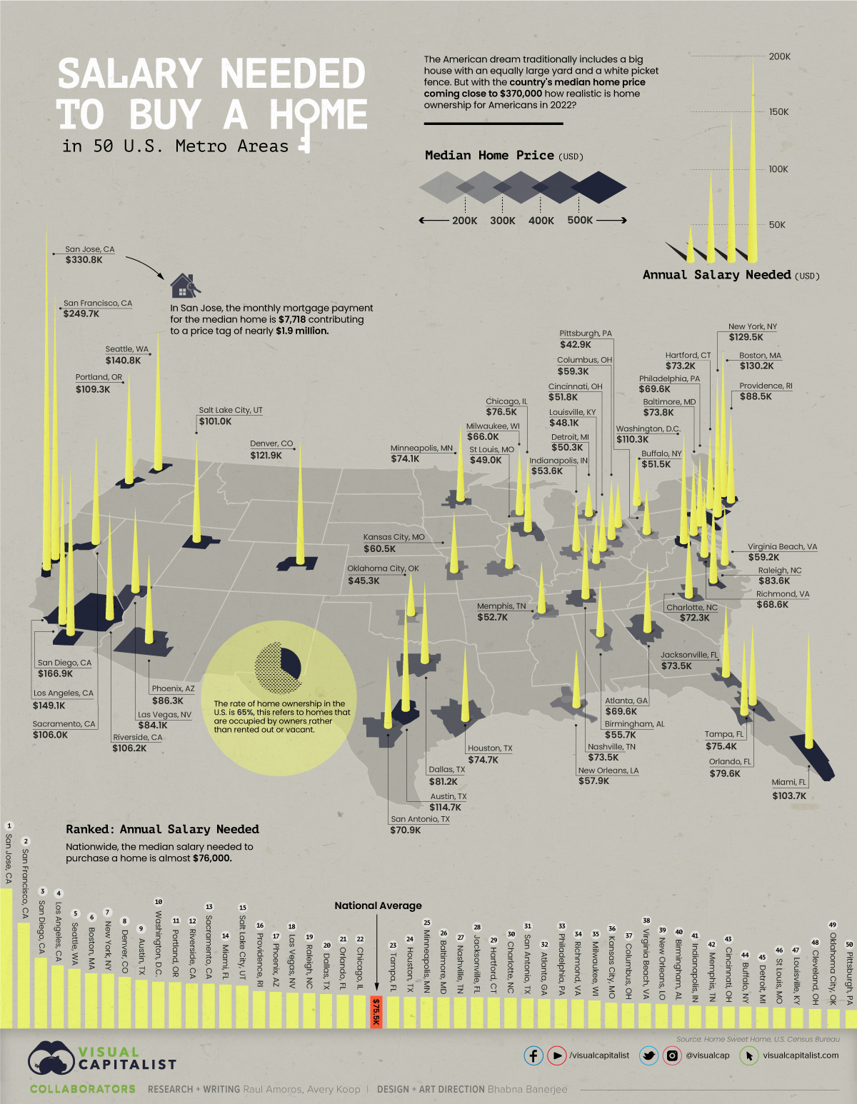


Depending on where you live, owning a home may seem like a far off dream or it could be fairly realistic. In New York City, for example, a person needs to be making at least six figures to buy a home, but in Cleveland you could do it with just over $45,000 a year.
This visual, using data from Home Sweet Home, maps out the annual salary you’d need for home ownership in 50 different U.S. cities.
Note: The map above refers to entire metro areas and uses Q1 2022 data on median home prices. The necessary salary was calculated by the source, looking at the base cost of principal, interest, property tax, and homeowner’s insurance.
San Jose is by far the most expensive city when it comes to purchasing a home. A person would need to earn over $330,000 annually to pay off the mortgage at a monthly rate of $7,718.
Here’s a closer look at the numbers:
Perhaps surprisingly, Boston residents need slightly higher earnings than New Yorkers to buy a home. The same is also true in Seattle and Los Angeles. Meanwhile, some of the cheapest cities to start buying up real estate in are Oklahoma City and Cleveland.
As of April, the rate of home ownership in the U.S. is 65%. This number represents the share of homes that are occupied by the owner, rather than rented out or vacant.
As of the time of this data (Q1 2022), the national yearly fixed mortgage rate sat at 4% and median home price at $368,200. This put the salary needed to buy a home at almost $76,000—the median national household income falls almost $9,000 below that.
But what kind of homes are people looking to purchase? Depending on where you live the type of home and square footage you can get will be very different.
In New York City, for example, there are fairly few stand-alone, single-family houses in the traditional sense—only around 4,000 are ever on the market. People in the Big Apple tend to buy condominiums or multi-family units.
Additionally, if you’re looking for luxury, not even seven figures will get you much in the big cities. In Miami, a million dollars will only buy you 833 square feet of prime real estate.
One thing is for sure: the typical American dream home of the big house with a yard and white picket fence is more attainable in smaller metro areas with ample suburbs.
The U.S. median household income is $67,500, meaning that today the typical family could only afford a home in about 15 of the 50 metro areas highlighted above, including New Orleans, Buffalo, and Indianapolis.
With the income gap widening in the U.S., the rental market remains a more attractive option for many, especially as prices are finally tapering off. The national median rent price was down nearly 3% from June to July for two-bedroom apartments.
At the end of the day, buying a home can be an important investment and may provide a sense of security, but it will be much easier to do in certain types of cities.
Visualized: The Value of U.S. Imports of Goods by State
Visualized: The Top 25 U.S. Newspapers by Daily Circulation
Household Income Distribution in the U.S. Visualized as 100 Homes
3 Insights From the FED’s Latest Economic Snapshot
Ranked: These Are 10 of the World’s Least Affordable Housing Markets
How Much Prime Real Estate Could You Buy for $1 Million?
How Every Asset Class, Currency, and S&P 500 Sector Performed in 2021
This Clever Map is a Window into 19th Century New York City
This infographic visualizes several net worth milestones to give you a better idea of where you stand today.
Published
on
By
The goalposts of wealth are always shifting due to inflation and other factors.
For example, someone with a net worth of $1 million several decades ago would have been considered very wealthy. According to recent survey results, however, $1 million is only enough to feel “financially comfortable” today.
In this infographic, we’ve visualized several money milestones to give you a better idea of what it really takes to be wealthy in America.
This table lists the data used in the above infographic.
It covers data on what it takes to get into the top one percent for wealth in key states, along with broader survey results about what net worth thresholds must be crossed in order to be considered “comfortable financially” or even “wealthy”.
According to Charles Schwab’s Modern Wealth Survey, a net worth of $774,000 is needed to feel “financially comfortable”, while $2.2 million is needed to be considered “wealthy”.
Both of these milestones are far greater than the average (median) American’s wealth, which according to the Federal Reserve, was $122,000 in 2019.
Research by Knight Frank determined that in order to be a member of America’s one percent, one would need a net worth of $4.4 million. This is very high compared to other developed countries such as Japan ($1.5 million), the UK ($1.8 million), and Australia ($2.8 million).
The difference is partly due to America’s large population of ultra high net worth individuals, which includes the country’s 724 billionaires. See below for a list of the top five countries by number of billionaires.
Source: World Population Review (As of 2021)
Focusing again on the U.S., we can also see large discrepancies at the individual state level. Entry into California’s one percent requires a net worth of $6.8 million, which is 62% higher than the national average.
California is famously home to many of the world’s richest people, including Google co-founder Larry Page, and Facebook founder Mark Zuckerberg.
Being a one percenter in Mississippi, on the other hand, requires $766,000. That’s 83% lower than the national average, and just a tad lower than the amount needed to be “financially comfortable” by the average American. This is partially due to Mississippi’s poverty rate of 19.6%, which according to the U.S. Census Bureau, is the highest in the country.
Only 22.7% of U.S. students are required to take a personal finance course. Which states have the highest levels of personal finance education?
Published
on
By
When you graduated from high school, did you know how to create a budget? Did you have an understanding of what stocks and bonds were? Did you know how to do your own taxes?
For many Americans, the answer to these questions is probably a “no”. Only 22.7% of U.S. high school students are guaranteed to receive a personal finance education. While this is up from 16.4% in 2018, this still represents a small fraction of students.
This graphic uses data from Next Gen Personal Finance (NGPF) to show the percentage of high school students required to take a personal finance course by state.
A standalone personal finance course was defined as a course that was at least one semester, which is equivalent to 60 consecutive instructional hours. Here’s the percentage of students in each state who have a required (not optional) personal finance course.
Eight states currently have state-wide requirements for a personal finance course: Alabama, Mississippi, Missouri, Iowa, North Carolina, Tennessee, Utah, and Virginia. Naturally, the level of personal finance education is highest in these states.
Five states have begun the process of implementing a requirement, with Florida being the most populous state yet to guarantee personal finance education for high schoolers. The state previously required schools to offer a personal finance course as an elective, but only 5% of students took the course.
Outside of the guarantee states, only 9.3% of students are required to take a personal finance course. That number drops to 5% for schools that have a high percentage of Black or Brown students, while students eligible for a free or reduced lunch program (i.e. lower income students) also hover at the 5% number.
The majority of Americans believe parents are responsible for teaching their children about personal finance. However, nearly a third of parents say they never talk to their children about finances. Personal finance education at school is one way to help fill that gap.
People who have received a financial education tend to have a higher level of financial literacy. In turn, this can lead to people being less likely to face financial difficulties.
People with low levels of financial literacy were five times more likely to be unable to cover one month of living expenses, when compared to people with high financial literacy. Separate research has found that implementing a state mandate for personal finance education led to improved credit scores and reduced delinquency rates.
Not only that, financial education can play a key role in building wealth. One survey found that only one-third of millionaires averaged a six-figure income over the course of their career. Instead of relying on high salaries, the success of most millionaires came from employing basic personal finance principles: investing early and consistently, avoiding credit card debt, and spending carefully using tools like budgets and coupons.
Once the in-progress state requirements have been fully implemented, more than a third of U.S. high school students will have guaranteed access to a personal finance course. Momentum is expanding beyond guarantee states, too. There are 48 personal finance bills pending in 18 states according to NGPF’s financial education bill tracker.
Importantly, 88% of surveyed adults support personal finance education mandates—and most wish they had also been required to take a personal finance course themselves.
When we ask the next generation of graduates if they understand how to build a budget, it’s more likely that they will confidently say “yes”.
Visualizing Which Countries Drink the Most Beer
Ranked: The 20 Countries With the Fastest Declining Populations
Visualizing the World’s Largest Oil Producers
Which Countries Produce the Most Natural Gas?
Timeline: The Domestication of Animals
Ranked: The World’s Largest Container Shipping Companies
Brand Loyalty is Declining for Most Luxury Automakers
Ranked: The Most and Least Livable Cities in 2022
Copyright © 2022 Visual Capitalist